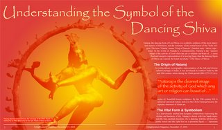
 In continuing with yesterday's theme I thought I would post the two-page magazine layout I had as an assignment in my computer graphics class. The instructor liked everything but the color choice. The title font is good old Papyrus...overused, but turned out OK for this application. I really like magazines especially those that are more photo and less text. When I open one, I like the image to reach out and grab me and make me pay the $5.00 to take the publication home.
A different thread
1 year ago


No comments:
Post a Comment